What is a Pantone book?
Hello everyone, it’s Richard Jant. Well,I frequently receive a common inquiry that revolves around a specific challenge. Many of you have asked, “As a designer, how do you effectively convey your shoe design to the manufacturing facility, especially when it comes to specifying the exact color? “ It’s not as simple as saying green or red or blue. Sure, white might be straightforward, but the reality is that there are numerous nuanced shades within each color category, be it red, blue, or even white. The same complexity applies to black. Thus, the ability to precisely articulate the desired color to the factory is of paramount importance.
But not even just the 靴工場, but also say you’re a designer and you want to communicate to your manager or whatever. You, how do you communicate color? Well, the answer is a Pantone book. So, what is a Pantone book? A Pantone book is, it’s their color chips, just like you’d see at a paint store. There’s a whole entire rainbow, and I’ll show you these in a second. There’s an entire rainbow, and basically what you do is you go to the book and you pick out the chip that matches the color you want. So here, let’s take a look at this picture.
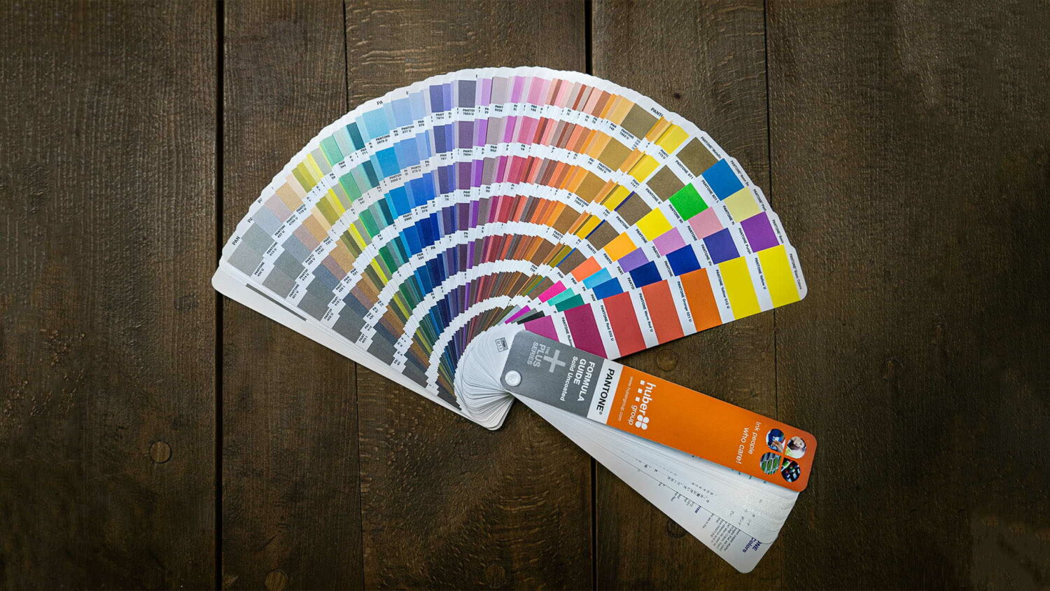
Alright, so here’s the Pantone book, and the Pantone company makes tons of different color checking supplies. These are paper guides, and again, here it is. Now they also have books that have little tear-off tabs that you can attach to your drawing or document. They also have fabric Swatch chips and they also have plastic ones.
Why the Pantone book is Important?
These books are important because every shoe factory, clothing factory, furniture factory, basically around the world, but let’s basically say in USA, Europe, they have these books. This is the color standard. So, the book that you buy is exactly the same one that the factory will have. So when you read off a number, say here, I’m looking at this yellow and it’s 390U, right? That’s the uncoated colorway 390. When the guy in the factory looks at your drawing here, right, and then C is 390, he knows exactly what color you’re referring to.
Now, again, the reason I said there’s two different books, there’s coated and uncoated, as if it’s a shiny surface or a matte finish. And have a look at this picture.
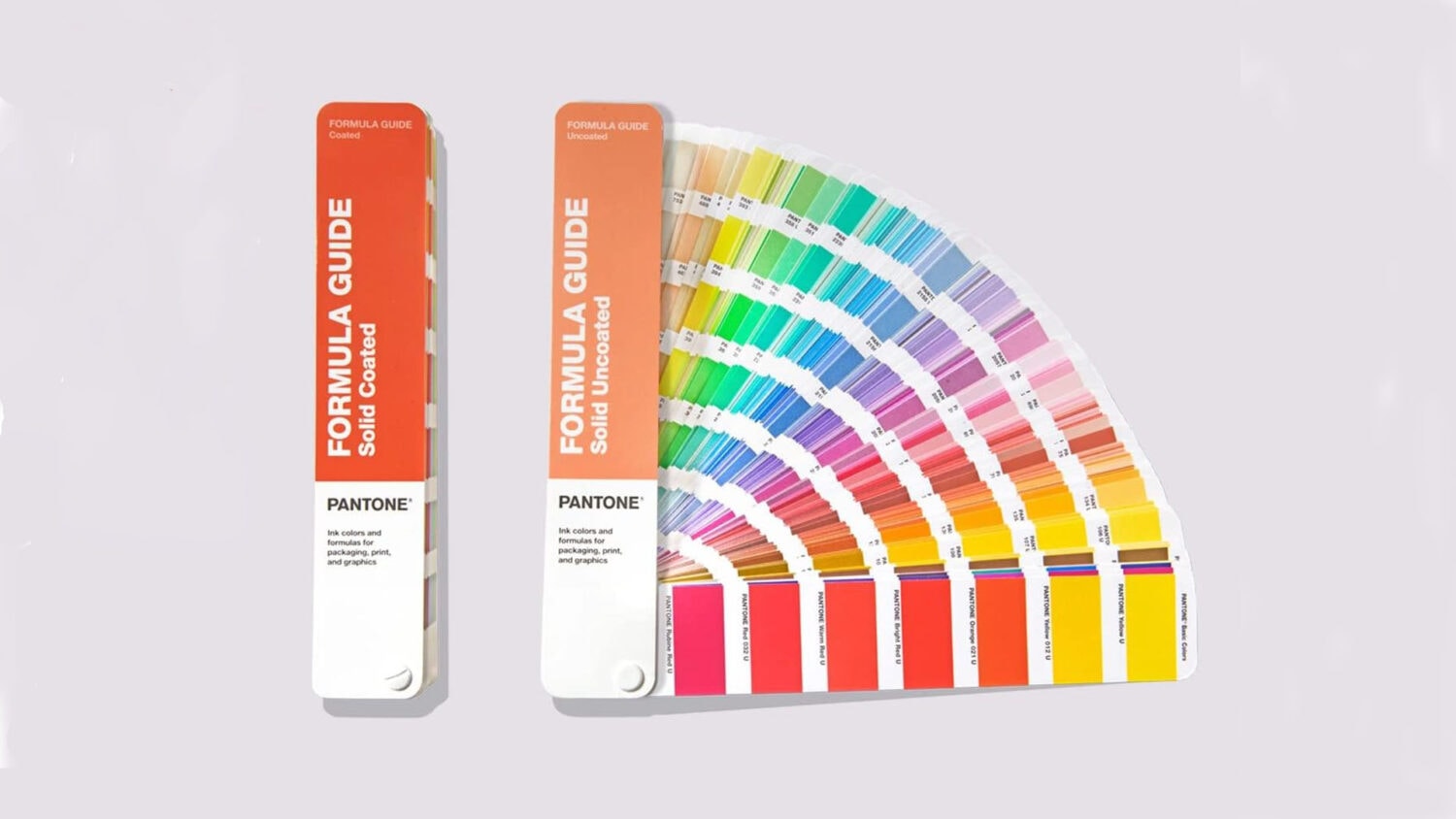
For example, here we have this particular shoe, and this is a nubuck, which has a matted surface. So this is where if you want to try to match it, you’re going to go to your book and you’re going to flip through, and you know, like I said, how many oranges are there here, right? Here’s a couple of dozen different oranges right, so we’re going to look at this book.
And if you look closely, you know, these books sometimes will have a little formula guide, and that’s for the ink supplier or the material supplier in China to make the formula to match the color. But that’s how the Pantone system works.
Hey, you know, I’ve had this problem where I’ve gone to the factory, and they’re having problems color matching, and you’re like, why? What’s going on here? Why is the color match not that good? Well, I go into their print shop and find that the book they have is really old, and they fan the pages so much that the color is starting to wear off and it’s got ink stains all over it. So the thing was a real mess.
So, I took that book away from the guy, threw it in the trash, and gave him my book. And when I got home, I bought another one because if your primary factory doesn’t have a clean Pantone, but your color matching is always going to suck, right? So that’s critically important. And again, this seems like an expensive tool, but it’s indispensable. There’s actually no other way.
How to use Pantone book?
Pantone books, they do wear out. You know, every couple of years, you should definitely look at getting a new one. But this is how you specify colors, and it’s pretty much an indispensable tool. If you’re creating a product specification, half of your job is to get the Pantone book out and talk to your designer and find the correct color chip that they need.
And they sometimes the factory will come back and say, ‘Hey, the color we have, a color that’s similar, go look up whatever number it is to see how close it is.’ And quite sometimes, too, that’s where the factory might say, ‘Hey, the color match is not perfect,’ or you could give a range, or you know, they might say we have colors available here. But anyways, so again, you know when we talk about creating specifications, picking the Pantone number, and using the right book, whether it’s the C book or the uncoated book.
Right, again, if it’s a matte finish material, you’ll use the uncoated book. If it’s a glossy, solid surface, then you’re going to use the coated book. So, that’s it really for designers. You, yeah, you absolutely need to have a Pantone book. For graphic designers too, right, and that’s how you check to see whether your shoe is made correctly, as you go back and look at the chip and make sure that they got it right. So, again, as a developer, critical tool, you must have that because you want to know whether they made the shoe correctly.
And then, hey, also having the, as a designer, having that book in your hands will just give you access to so many options that you can think about, okay, what do I really want this shoe to look like? And as you flip through the book and you look at all the color options. And again, when you go back to the Pantone thing, if you’re doing apparel or home goods too, they have a textile Pantone series, which is a whole nother set of colors rather than sort of the graphic and sort of footwear colors. So, again, but Pantone is the standard.
The shoe factories in China, in Europe, they all have access to the same book, and that’s really how you communicate. In the old days, I mean, we would literally have to cut out pieces of fabric or whatever it was that we were doing and staple it to the drawing and mail it to the factory so they can match it. But nowadays, you don’t even do that. Now if you go to your software like Illustrator or Photoshop, they will have Pantone color in the system.
Just so you know when you print that drawing out, will it be accurate to the Pantone number? It will not be. Really, the only way to really know what that color looks like and to set the standard for the factories not to have your computer drawing. I mean, you can play around with the computer drawing to get it to match the chip pretty well. But again, that all comes down to what kind of printer you’re using.
Right. And I’ve used, you know, ten thousand dollar printers and two hundred dollar printers. And do they ever match the Pantone book exactly? Never. So, in that case, that’s where you really got to use your book, specify your color, just give them the number. You know, if you’re a really helpful designer, you might tell them what page it’s on because this book is several hundred pages, so they can find the color rapidly. And it’s also good for you if you have to go back and look up the color again. If you know the page number that it’s on, that helps.
So that’s it, that’s Pantone number, that’s how you specify color, absolutely critical tool.

